For the full story download the pdf here.
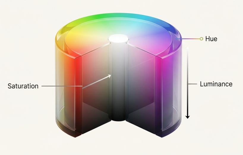
The Science of Perception Understanding video color begins with the three pillars of human perception: Hue (the color family), Saturation (the intensity), and Luminance (the brightness). While we see intuitively, digital cameras and displays operate on the RGB model, often compressing color data (Chroma) to save file space because the human eye is far more sensitive to brightness (Luma) than color detail.
Correction vs. Grading The professional workflow is divided into two distinct stages:
- Colour Correction (The Science): This acts as the foundation. The goal is technical integrity—adjusting exposure and white balance to ensure the footage looks natural and accurate to the human eye.
- Colour Grading (The Art): This is the creative layer. Grading stylizes the footage to create a specific mood or “look” that serves the story.
Painting with Emotion Grading is not just about aesthetics; it is about psychology. Colorists use specific palettes to manipulate audience response: Red creates specific feelings of passion or danger, Blue evokes isolation or calm, and Green can generate a sense of the unnatural or “digital” atmosphere. To achieve this, artists rely on objective diagnostic tools like Waveforms and Vectorscopes rather than trusting their eyes alone.