Introduction: The Quest for the Perfect “Look”
We’ve all been there. You’re scrolling through your feed and you stop on a photo or a video clip that just feels different. The colors are rich, the mood is palpable, and the entire image has a polished, cinematic quality. You think, “I can do that,” and dive into your favorite editing app, searching for the one filter that will unlock that same magic for your own work.
But the results are often disappointing – flat imitation misses the mark.
The secret to a stunning visual style isn’t about finding the perfect preset. It’s about understanding a few counter-intuitive truths; A blend of meticulous science and evocative art that transforms an ordinary image into something unforgettable.
This article will reveal five of the ‘truths’ – They may change how you approach color in your work forever.
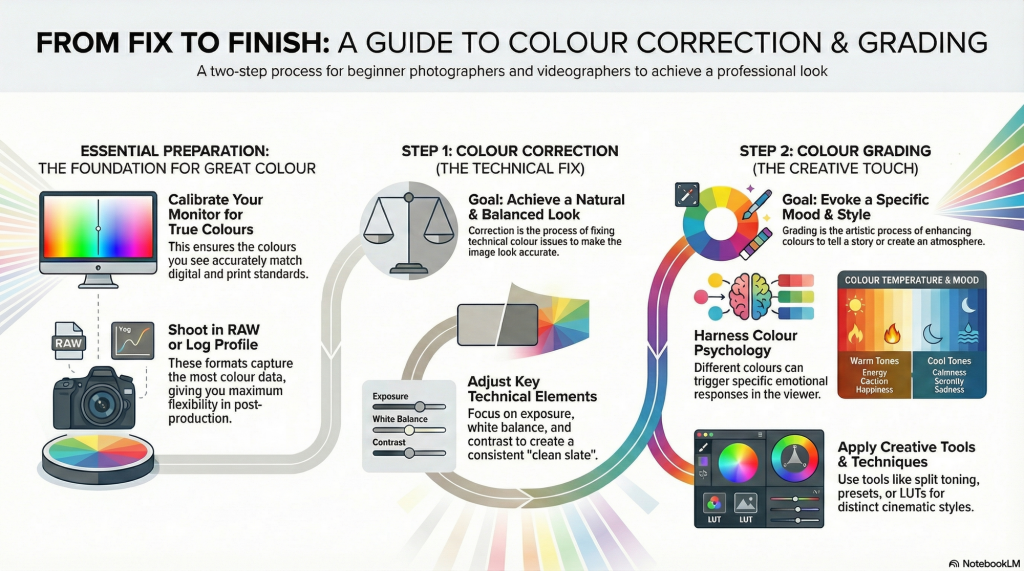
1. You Can’t Grade a Mess:
The single most common mistake beginners make is jumping straight to the fun part – creative styling. But professional color grading is always the second step in a mandatory two-part process. The first step is color correction and it SHOULD NOT be forgotten.
Color Correction is the technical process of fixing issues to create a clean, accurate, and balanced starting point. The goal is to adjust exposure, white balance, and contrast to make the image look natural and consistent, as if you were seeing it with your own eyes. It’s about establishing a neutral, correct base.
Color Grading is the creative process that comes after correction. This is where you stylize the corrected image to create a specific mood, feeling, or artistic effect. You might add warm, nostalgic tones for a romantic scene or cool, desaturated hues for a dramatic one. In professional circles, you’ll also hear this process referred to as the “primary” and “secondary” grade, respectively.
2. Your Screen Is Lying to You (And Everyone Else’s Is Too)
Many photographers and digital artists face frustration when their meticulously edited photos appear dull or color-shifted on different devices. This common issue arises primarily because most screens are uncalibrated, causing inconsistent color and brightness representation.
Calibration involves adjusting a monitor’s color and brightness to industry standards using a colorimeter, whenever possible, to create custom profiles aligned with universal standards such as D65 (6500K), the daylight color temperature. Brightness calibration, targeting around 80 to 120 cd/m², is crucial, especially to match print outputs.
Ultimately, calibration is about predictability as it transforms the monitor into an objective reference point, reducing guesswork and frustration, providing a reliable foundation so that creative edits translate accurately across all viewing platforms and preserves the integrity of your edits from screen to print to client viewing.
3. You’re Not Just Changing Colors; You’re Directing Emotions
At its highest level, color grading moves beyond technical adjustments and becomes a powerful tool for psychological influence. The color choices you make have a profound, often subconscious, effect on the viewer’s emotions, perceptions, and even their physiological responses.
Understanding basic color psychology is fundamental to visual storytelling. Each color family carries powerful associations that can reinforce your narrative:
• Warm Tones (Reds, Yellows, Oranges): These colors are associated with passion, energy, happiness, and excitement. They are active and attention-grabbing. Physiologically, warm tones can even activate a viewer’s sympathetic nervous system, increasing their energy levels.
• Cool Tones (Blues, Greens): These colors are associated with calm, serenity, stability, and sometimes sadness or contemplation. They are often used to promote a sense of relaxation or to create a moody, introspective atmosphere.
Beyond mood, color can be used to create a sense of physical space and depth in a two-dimensional image. A key principle is that “Warm colours appear closer to the viewer, while cool colours recede.” You can use this to make a subject pop from the background or to make a landscape feel more vast and distant.
4. A “Look” Isn’t One Button—It’s a Four-Part Recipe
The term “look” can feel vague and mysterious, but for professionals, it’s a structured and intentional creation. Instead of thinking of a style as a single filter, they build it in layers using a clear framework. A cohesive look is a recipe with four key ingredients:
1. Tone: This is the image’s contrast. It goes beyond a simple contrast curve and involves using primaries (lift, gamma, gain) to further refine contrast in the shadows, midtones, and highlights. This gives you precise control over the luminance relationships in your image, from deep, rich blacks to bright, clean whites.
2. Scheme: This refers to the global adjustments that create an overall color cast. It’s a broad-strokes approach that pushes the entire image toward a particular color harmony, like the popular teal-and-orange look, where shadows are shifted toward teal and highlights toward orange.
3. Palette: This involves adjustments to individual colors. This is where you create color separation, ensuring your blues and greens don’t blend into a muddy cyan but stand out distinctly. You might tweak blues to be more cyan, or reds to be more orange, creating unique harmonies that define your style.
4. Texture: This is a catch-all for the final visual elements that give the image a physical feel. This includes effects like adding film grain for a vintage quality, sharpening to add crispness, or adding glow or halation (a subtle bloom around highlights) to emulate the look of older film lenses.
By understanding this four-part recipe, you can deconstruct the styles you admire and, more importantly, have a clear roadmap for building your own signature look from the ground up.
5. That Perfect Preset Is a Starting Line, Not a Finish Line
Presets and Look-Up Tables (LUTs) are everywhere, and for good reason. They are incredibly useful tools for speeding up your workflow, experimenting with different styles, and achieving a consistent look across a series of images. However, they are powerful shortcuts, not magic bullets. Relying on them without understanding how they work leads to two major pitfalls.
1. They require a clean base: A preset or LUT is designed to be applied to a properly color-corrected image. If your underlying photo is too dark, too bright, or has an incorrect white balance, the LUT will not work as intended. In fact, it will often amplify the existing problems, resulting in crushed blacks, blown-out highlights, or bizarre color casts.
2. They can be generic: An over-reliance on popular presets can make your work look generic and rob it of a personal touch. A preset doesn’t know the specifics of your image—the lighting, the subject, or the story you want to tell. Applying it without adjustment is like wearing a suit off the rack without any tailoring.
The professional approach is to treat a preset or LUT as an excellent starting point, not the final destination. Apply it, see what it does to your image, and then dive into the settings. Tweak the exposure, adjust the color balance, and modify the individual color values to make the look truly your own and, most importantly, perfectly suited to that specific image.
Conclusion: Tell Your Story with Color
Color grading is not a mysterious art reserved for an elite few. It is a thoughtful, intentional process that marries technical science with artistic storytelling. It’s about building a solid foundation through correction, ensuring accuracy through calibration, and then using color to shape emotion and guide the viewer’s experience.
By moving beyond the simple search for the next great filter and embracing these core concepts, you can gain profound control over your visual narrative. The tools are more accessible than ever; the only thing left is to decide what you want to say.
Now that you know the secrets behind the screen, which story will you choose to tell with color?