Black and white photography has a timeless power that color images often struggle to match. By stripping away the distraction of color, you allow the viewer to connect more deeply with the core elements of a photograph: its shapes, textures, and mood. The interplay of light and shadow becomes the main event.
This guide is designed to simply explain two of the most important elements you can control to make your black and white photos more compelling. We’ll explore tonal range and tonal contrast – the foundational tools you’ll use to tell a powerful story with your images.
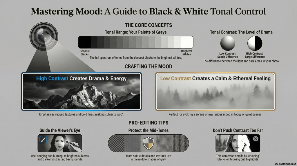
Exactly what do Tonal Range and Tonal Contrast mean ?
| Term | Simple Explanation |
| Tonal Range | This is the full spectrum of tones in your photo, from the deepest, inky blacks to the brightest, pure whites, and every shade of gray in between. Having a wide tonal range means you have a rich palette of grays to work with, giving your photo depth and dimension. |
| Tonal Contrast | This describes the difference between the light and dark areas in your photo. You can think of it as the level of drama in the image. High contrast means there’s a very stark difference between light and dark, while low contrast means the tones are closer together and more subtle. |
Crafting a Mood – Understanding the definitions is good – but how to use them to create a specific feeling is KEY. The magic of shaping tones generally happens in photo – editing by refining light and shadow to match your artistic vision. In B & W photography, controlling tone and contrast is the primary way you communicate a mood or feeling to your viewer – two examples of how different tonal strategies can create a specific emotional impact:
• High Contrast: This approach creates a sense of drama, energy, and intensity. The strong separation between deep blacks and bright whites makes subjects “pop.” It is an excellent choice for emphasizing the rugged textures in landscape photography or the bold lines in architectural photography.
• Low Contrast: This strategy, where the tones are closer together, creates a much softer and calmer feeling. It’s perfect for evoking a serene, gentle, or ethereal mood. Photographers often use low contrast to capture the quiet mystery of foggy mornings or other calm scenes.
Shaping the Tones in Your Photo – Three simple principles to get you started.
1. Find a Good Starting Point Many editing tools offer presets and / or LUTs (some free ones here). Think of them as a “thoughtful starting point” that gets you most of the way there before you start working the finer details.
2. Make Targeted Adjustments The classic technique of “dodging and burning” is simply about lightening (dodging) and darkening (burning) specific parts of your photo. This is one of the most powerful tools you have. Its primary benefit is that it allows you to guide the viewer’s eye exactly where you want it to go. You can brighten your main subject to make it stand out and darken distracting background elements to reduce visual noise.
3. Protect the Mid-Tones It’s easy to get obsessed with making your blacks blacker and your whites whiter, but the shades of gray in the middle are just as important. The mid-tones are where most of the subtle details and textures live, so protecting them is crucial. Managing the smooth transitions between these middle grays is what gives a black and white photo a refined, professional, and natural look.
Keep in Mind Learning to control tone is a journey, and every photo editor runs into a few common pitfalls along the way. To help you experiment, here’s some advice to help you avoid a few common frustrations. Keep these tips in mind to help you get great results faster.
1. Don’t Push Contrast Too Far It can be tempting to crank the contrast slider all the way up, but this can erase important details in the darkest shadows and brightest highlights. This is often called “crushing” your blacks or “blowing out” your highlights, and it can make a photo look harsh. Your best friend in avoiding this is the histogram. It will show you if your adjustments are pushing the tones off the edge of the chart, helping you ensure you’re not losing crucial detail unnecessarily.
2. Pay Attention to the Middle Grays Remember, focusing only on the extreme blacks and whites while ignoring the mid-tones can make an image look flat and uninteresting. The subtle adjustments you make to the middle grays are often what make a photo feel expressive and full of life.
3. Watch Out for “Banding” in Skies When you make aggressive adjustments to areas with smooth gradients—like a clear sky or a foggy background—you can sometimes create strange lines or blotchy patterns. This is often called “banding” or “noise.” To avoid this, always make gentle, subtle adjustments in these delicate areas and add noise reduction if needed.
Now It’s Your Turn
With these concepts in mind, it’s time you started your own creative exploration. Have Patience Mastering tonal range and contrast is both a technical skill and a creative journey. It’s about learning the tools and then using them to express how you see the world. As you gain experience, controlling the mood and story of your images will become second nature.
The absence of colour forces the viewer to connect directly with shape, texture, and tone, that fundamentally define the image’s emotional impact. Tonal range – the spectrum from the deepest blacks to the brightest highlights – determines the perceived “fullness” of the image; a broad range ensures the photo feels rich and dimensional, whereas a narrower range is used to create a moodier, more minimalist effect.
Tonal contrast dictates the intensity of the interaction between light and dark areas, serving as a primary tool for visual storytelling. The emotional response is shaped by how these tones are manipulated:
• Drama and Intensity: High tonal contrast makes subjects “pop” and is often used to convey drama, especially in architectural or rugged landscape photography.
• Serenity and Mystery: Lower contrast and smooth tonal transitions lend themselves to a serene or ethereal feel, which is particularly effective in calm or foggy scenes.
• Specific Atmospheres: High-key or low-key conversions can be used for special mood effects, relying on subtle adjustments to evoke a specific artistic vision.
Skillful editing of these elements allows the viewer to “travel” through the image, discovering textures and details that might otherwise remain hidden. By matching the tonal strategy to the emotional intent – such as using crisp contrast for ruggedness or gentle gradations for mystery – a photo editor can elevate a monochrome image from a simple technical exercise to a compelling narrative.
The best way to see this and begin to improve your B & W editing is to simply open one of your own photos and start experimenting deliberately aiming for a specific outcome eg: Try a high – contrast edit to create drama. Then, try a low-contrast version of the same photo to create a soft, quiet mood. See for yourself how a few simple adjustments can tell a completely different story.