
Mastering colour attributes is essential for precise digital grading. Whether developing custom 3D LUTs, tweaking RAW files, or assessing values against a neutral middle-gray, understanding hue, saturation, lightness, tints, tones, and shades allows you to dictate the exact visual mood of your final image.
You can download a cop of the graphic suitable for printing in A4 portrait mode here
Hue
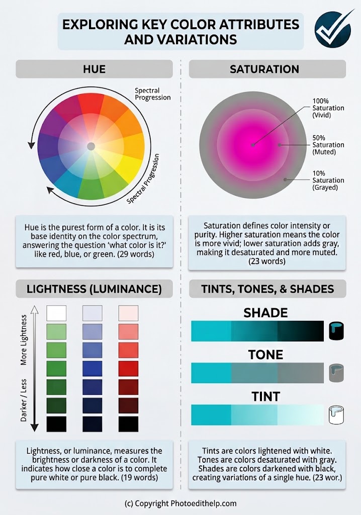
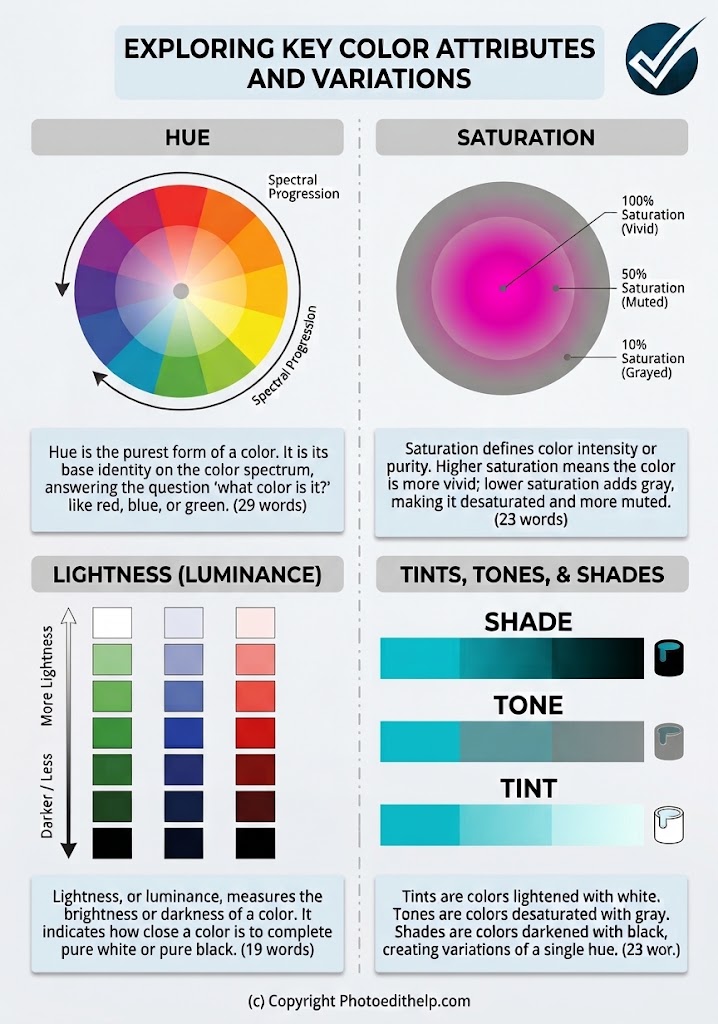
Hue is the fundamental identity of a colour – the pure pigment as it appears on the spectrum. In photography and digital editing, it answers the basic question: “What colour is this?” Whether you are isolating the sweeping turquoise of a coastal sky or the deep heather of a Highland glen, hue is the starting point for all targeted colour manipulation and balancing.
Saturation
Saturation dictates the intensity and purity of a hue. A colour at 100% saturation is vivid and aggressive, drawing the eye immediately. As saturation is reduced by introducing gray, the colour becomes more muted and subdued. Carefully managing saturation is critical when processing images to ensure environmental colours remain natural and cohesive without becoming artificially harsh.
Lightness (Luminance)
Lightness, or luminance, refers to the brightness or darkness of a specific colour, determined by its proximity to pure white or pure black. In editing workflows, adjusting the luminance of individual colour channels can dramatically alter exposure and contrast. It allows you to brighten a specific element within a frame – like foliage or sky – without affecting its underlying hue or introducing unwanted saturation.
Tints, Tones, & Shades
These elements represent the variations achievable when a pure hue is mixed with neutral values, expanding your palette for complex grading and atmospheric adjustments:
- Tints: Created by blending white into a hue, resulting in lighter, softer, and more pastel variations. Tints are often used to create airy, high-key aesthetics.
- Tones: Produced by mixing gray with a hue. This subtly desaturates the colour, often yielding the sophisticated, cinematic look highly sought after in modern post-processing and custom LUT development.
- Shades: Formed by adding black to a hue, creating deeper, richer, and more intense variations that add weight, contrast, and shadow to a composition.
You can download a cop of the graphic suitable for printing in A4 portrait mode here