
A New Era of Color Precision ?
The video by Anthony Morganti and article by Adobe provide a comprehensive guide on using Adobe Camera Raw explain how to interpret visual data through the histogram and vectorscope to prevent loss of detail in extreme highlights or shadows.
The Adobe text also details various manual and automatic sliders for managing exposure, contrast, and white balance, alongside advanced tools like Point Color and Curves for precise adjustments. Users can also learn to enhance image depth using Clarity and Vibrance or apply artistic effects through Color Grading wheels.
Furthermore, the sources highlight the Targeted Adjustment tool, which allows editors to modify specific regions of an image by interacting directly with the preview.
1. Introduction: Beyond the “Eyeball” Test
One of the most persistent frustrations in high-end digital imaging is the elusive “greenish” tint or inconsistent subject color – a problem that often remains unresolved when relying solely on visual judgment.
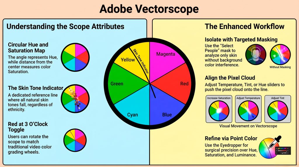
Traditionally, editors have relied on the “eyeball test,” a subjective approach heavily influenced by monitor calibration, ambient lighting, and optical fatigue. The introduction of the Adobe Vectorscope in Adobe Camera Raw (ACR) transforms this process from a guessing game into a rigorous science. By providing a circular representation of hue and saturation, the tool offers a data-driven map of an image’s “color character.”
This represents a foundational shift for the modern creator, moving the priority from how an image “looks” on a specific screen to what the objective data confirms.
2. The Anatomy of Color: Decoding the Circular Plot
While histograms are indispensable for managing luminance and exposure, they offer no insight into the specific mathematical behavior of color. The Vectorscope fills this strategic gap by ignoring light levels to focus exclusively on chroma. While a histogram prevents shadow or highlight clipping, the Vectorscope allows the technologist to manage the relationship between different hues and their respective intensities.
The interface is composed of three primary data components:
- The Angle (Hue): The tool uses a 360-degree circle to represent the color spectrum. Markers indicate the positions of primary and secondary colors: Red, Magenta, Blue, Cyan, Green, and Yellow. In professional grading, we look for the “Orange/Teal” axis – the fundamental cinematic complementary pair.
- The Distance (Saturation): This represents the intensity of the color. The center is neutral (0% saturation), and the perimeter is fully saturated.
- The Cloud (Pixel Plot): Every pixel is visualized as a data cloud. A clustered cloud indicates unified, harmonious color, while a scattered cloud represents high color variety or “pollution.”
Crucially, the technologist must recognize the interdependence of light and color: while the Vectorscope reads chroma, luminance adjustments significantly impact the plot. High-contrast curves effectively “stretch” the chroma values, causing a visible “jump” in saturation as the data cloud expands toward the perimeter.
3. The Universal Truth: The Skin Tone Indicator
The most strategically significant feature of the Vectorscope is the “Skin Tone Indicator.” This tool is built upon a fundamental biological reality: regardless of ethnicity or race, all human skin tones share the exact same hue. While skin differs in saturation and brightness, it falls on a singular hue line located between red and yellow (approximately at the 10:30 or 11 o’clock position, depending on your rotation settings).
To enable this, right-click the Histogram, select Show Vectorscope, and ensure Show Skin Tone Indicator is checked. For the editor, this line is the ultimate truth-teller. Because the Vectorscope ignores luminance, a person with very dark skin and a person with very light skin will both project data onto this same line if their color is accurate. If the data cloud drifts toward yellow or green, the skin is objectively “off,” regardless of what an uncalibrated monitor might suggest.
4. The Precision Workflow: Masking and Point Color
To maximize accuracy, the Vectorscope must be “blind” to the environment. A global view is often misleading, as background elements like blue skies or foliage “pollute” the data cloud with irrelevant color information.
The professional Targeted Adjustment workflow is as follows:
- Isolation: Use the “People” masking tool to select facial skin and body skin. Check the red overlay to ensure clothing and background are excluded. This isolates the data cloud to the subject’s skin only.
- Observation: Analyze the masked cloud. If the cluster is not centered on the skin tone line, identify the direction of the drift (e.g., toward yellow/green).
- Refinement via Point Color: Open the Color Mixer and select the Point Color tab. This is the “Golden Rule” of the workflow: use the Eyedropper to sample a mid-tone area of the skin – avoid highlights or deep shadows.
- Adjustment: Manipulate the Hue slider to align the data cloud with the indicator line. As a professional standard, keep the Saturation level below the midpoint (halfway to the edge) to maintain a natural look.
- The Variance Slider: Use this to unify the tone. Moving Variance to the left pulls disparate, blotchy colors toward your sample, effectively “tightening” the data cloud for a smoother, professional finish.
5. Pro-Level Nuances: Integration and Limitations
Maintaining workspace consistency is vital for creators moving between photography and cinematography. By default, the ACR Vectorscope may place Red at the 12 o’clock position. However, the Color Grading wheels in the very same ACR panel are locked with Red at 3 o’clock, as are standard video applications like Premiere Pro.
While the ACR Vectorscope is a monumental addition, professionals should note its current UI limitations: the window size is currently fixed and cannot be enlarged for more granular analysis of the pixel cloud.
Pro-Tips for Senior Editors:
- Keyboard Shortcut: Use the “T” key to quickly toggle the Targeted Adjustment tool for rapid corrections.
- Visualise Range: When using Point Color, enable Visualise Range. This turns the entire preview image grayscale except for the pixels currently targeted by your eyedropper sample, providing absolute certainty over which areas are being modified.
6. Conclusion: From Correction to Creative Expression
Mastering the Adobe Vectorscope marks a transition from reactive, “best-guess” editing to intentional, data-driven color grading.
By relying on objective indicators rather than subjective sight, you gain the “confidence of accuracy.” This technical foundation is the prerequisite for sophisticated visual storytelling; once the skin tones are mathematically correct, the creator is free to explore creative grading with the assurance that the core of the image remains professionally grounded.